Michelin
French multinational tyre manufacturing company
🔗 Connections
Sector
Region
Country
Industry
Language
Revenue Range
Operating Income Range
Net Profit Range
Employees Range
Product Or Material Produced
Product
Headquarters Location
Subsidiary
Foundation Date
Foundation Year Bucket
🎨 Color Analysis
Dominant Colors
Color Tone
👁️ Visual Attributes
Lighting
Perspective
Photography Genre
Concept
Background
Color Scheme
Depth
👤 Human Attributes
Hair Style
Clothing Style
Posing
Body Section
Official Websites
- https://www.michelin.com/en
- https://guide.michelin.com/en
- http://www.michelin.com
- https://www.michelin.com
- https://www.michelin.in
- https://www.michelin.com.tr
- https://www.michelin.com.mx
- https://www.michelin.dk
- https://michelin.it
- https://www.michelin.com.br
Brand Guidelines
2002
Brand Summary
Mission
- The MICHELIN brand represents a crucial capital for the development of the Group’s activities and the expression of our distinctive values of performance and responsibility. Recognition of the MICHELIN brand relies on its visibility, repetition, and consistency in the use of its signature colours, shapes, and name, forming its visual identity.
Core Values
- performance
- responsibility
- quality
- innovation
- dynamism
- closeness
- professionalism
- long-lasting success
- respect for facts, people, and environment
Target Audience
- Various publics including customers, partners, and stakeholders who interact with the brand across all media, products, and geographies.
Personality Traits
- friendly
- welcoming
- dynamic
- innovative
- professional
- trustworthy
- approachable
- positive
- expressive
- humorous
Visual Identity Overview
- The visual identity is built around the inseparable elements of the logo: the word MICHELIN, the blue box, Bibendum (the Michelin Man) in a welcoming posture, and a yellow underline. The color palette is blue, white, yellow, and black, each with specific meanings. Typography is distinctive, with exclusive use of a custom typeface for the logo and Frutiger/Utopia for communications. The brand uses strong, consistent visual codes, with strict rules for logo usage, protection zones, and applications across all media and products.
Categories
Brand Imagery
- Le logotype de la marque MICHELIN est composé de quatre éléments indissociables, qui ne peuvent être modifiés, déplacés ou altérés : le mot MICHELIN, le cartouche bleu, Bibendum dans sa posture d’accueil, et le filet jaune qui souligne la typographie. Les proportions, couleurs et positions de ces quatre éléments sont immuables. Le logotype MICHELIN, tel qu’il est défini, s’applique sur tous les supports* dans le respect de ses proportions, couleurs et règles (détaillées plus loin).
- The MICHELIN brand logo is made up of four inseparable elements which cannot be changed, moved or altered: the word MICHELIN, the blue box, Bibendum - the MICHELIN Man -in his welcoming posture and the yellow rule that underlines the lettering. The proportions, colours and positions of these four items are unchangeable.
- Le logotype MICHELIN est entouré d’une zone de protection qui garantit sa bonne visibilité et permet sa reconnaissance fidèle. Cette zone de protection est un rectangle technique invisible dans lequel aucun élément ne peut être présent.*
- The MICHELIN logo is surrounded by a protection zone which ensures that it is always clearly visible and easily recognized. The protection zone is an invisible, theoretical rectangle in which no other element may appear.*
- Les éléments graphiques, représentés ici par des rayures, le mot élément et les ronds, ne peuvent pas être plus proches du logotype MICHELIN ; ils sont ici en dehors et en limite de la zone de protection.
- The graphic elements, shown here by the stripes, the word element and the circles, may not be any closer to the MICHELIN logo; in this example, they are outside and on the edge of the protection zone.
- Sur tous les fonds (fonds blancs, aplats clairs ou foncés, visuels clairs ou foncés), le cartouche bleu est délimité par un filet extérieur blanc, d’une épaisseur équivalente à la moitié de celle du filet jaune du logotype.
- Seul le cartouche, et en aucun cas Bibendum, est délimité par un filet blanc.
- On all types of background (white backgrounds, light or dark solid tints, light or dark visuals), the blue box is outlined by a white line, with a width equal to half that of the yellow rule in the logo unit.
- Only the box, and under no circumstances Bibendum, is outlined by a white line.
Color Palette
- Bleu, blanc, jaune, noir. La marque MICHELIN se reconnaît d’abord à ses couleurs impactantes et riches de sens. Le bleu, couleur universelle, évoque la haute technologie et l’innovation. Le blanc renforce la complémentarité entre le nom MICHELIN et Bibendum, il communique une image de qualité et d’innovation. Le jaune incarne le dynamisme et la proximité. Le noir fait référence au métier principal de la Marque : le pneu. C’est l’association de ces quatre couleurs qui forme un code visuel exclusif à la Marque.
- Blue, white, yellow and black. The first thing people recognize in the MICHELIN brand is its high-impact and very meaningful colours. Blue, a universal colour, evokes high technology and innovation. White emphasises the consistancy between the name MICHELIN and Bibendum; it conveys an image of quality and innovation. Yellow embodies dynamism and closeness. Black is a reference to the Brand’s core business: tyres. The combination of these four colours forms a visual code exclusive to the Brand.
- Selon les supports et leur mode d’impression respectif, les couleurs spécifiques du logotype (bleu, blanc, jaune et noir) ont des références appropriées.
- The codes used to identify the logo’s specific colours (blue, white, yellow and black) vary in function of the media used and their respective printing technique.
- Les proportions indiquées ici pour les utilisations en quadrichromie, RAL, RVB, DIC et Textile sont indicatives. Elles peuvent être adaptées à chaque support de façon à se rapprocher optiquement le plus près possible du référentiel Pantone®.
- The proportions given here for four-colour process, RAL, RGB, DIC and textile techniques are for information purposes only. They should be adapted to each medium in order to achieve the closest possible match to the Pantone® specifier on visual examination.
- Références Pantone® / Pantone® codes Références d’encres pour impression en tons directs Reflex Blue Blanc / White Yellow Process Black
- Références Quadrichromie / Four-colour process codes Références d’encres pour impression en quatre couleurs primaires (CMJN) Codes for inks used to print in four primary colours (CMYK) Cyan 100% Blanc / White Noir / Black 100% Magenta 70% Magenta 5% Jaune / Yellow 100%
- Références RAL / RAL codes Références de peintures industrielles, utilisées sur support métallique Codes for industrial paints used on metallic surfaces 5002 9010 1018 9017
- Références RVB / RGB codes Couleurs écran (TV, projection, Internet) On-screen colours (TV, projection, Internet) R-0 V(G)-0 B-153 Blanc / White R-255 V(G)-255 B-0 R-0 V(G)-0 B-0
- Références DIC / DIC codes Références d’encres utilisées au Japon pour impression en tons directs Codes for inks used in Japan in direct colour printing F29 Blanc / White F163 F200
- Références Pantone® Specifier textile / Pantone® Specifier Textile Colour codes Références d’encres sur textile (à adapter en fonction des différents tissus) Codes for textile inks (may be adjusted to suit different fabrics) 19-4052 Blanc / White 13-0758 19-0303
- Les couleurs d’accompagnement de la marque MICHELIN sont le bleu et le jaune. Elles sont utilisées ensemble et principalement en aplat. Ces couleurs, représentant l’identité MICHELIN, doivent être utilisées le plus souvent possible pour renforcer la reconnaissance de la Marque.
- The MICHELIN brand’s accompanying colours are blue and yellow. They are used together and primarily as solid tints. These two colours, representing the MICHELIN identity, should be used as often as possible to reinforce Brand recognition.
- La présence du blanc et du noir dans le système graphique peut se manifester dans l’utilisation de Bibendum et des typographies (typographie blanche sur fonds bleus et noire sur fonds jaunes).
- The presence of white and black in the graphic system is reflected in the use of Bibendum and the typefaces (white lettering on blue backgrounds and black lettering on yellow ones).
- La répartition du bleu et du jaune se fait dans les proportions suivantes : - de 95% maximum à 5% minimum pour le bleu - de 5% minimum à 95% maximum pour le jaune
- Blue and yellow are distributed in the following proportions: - from a maximum of 95% to a minimum of 5% for blue - from a minimum of 5% to a maximum of 95% for yellow
- Références des couleurs d’accompagnement bleu et jaune Codes for the accompanying colours blue and yellow Pantone® / Pantone® Pour impression en tons directs For direct colour printing Quadrichromie / Four-colour process Pour impression en quatre couleurs primaires For printing in four primary colours Cyan 100% Magenta 5% Magenta 70% Jaune / Yellow 100% Reflex Blue Yellow RAL / RAL Pour les peintures industrielles For industrial paints 5002 1018 DIC / DIC Encres utilisées au Japon Inks used in Japan F29 F163 RVB / RGB Pour usage écran : TV, projection, Internet,… For on-screen use: TV, projection, Internet,… R-0 V(G)-0 B-153 R-255 V(G)-255 B-0 Pantone® Specifier Textile / Pantone® Specifier Textile Encres textile Textile inks 19-4052 13-0758
Typography
- Le nom MICHELIN est reconnaissable partout dans le monde, grâce au dessin particulier de ses lettres. La force des lettres majuscules exprime la puissance, l’inclinaison à droite suggère le dynamisme et la mobilité. Les angles arrondis de certaines lettres lui confèrent un caractère convivial.
- La typographie spécifique du nom MICHELIN est réservée à l’expression exclusive du logotype. Elle ne doit jamais être utilisée en dehors de celui-ci.
- The name MICHELIN is recognized throughout the world, thanks to the distinctive design of its letters. The force of the capital letters expresses strength; the lean to the right suggests dynamism and mobility.
- The rounded angles of certain letters give it a friendly air. The specific typeface of the MICHELIN name is exclusively reserved for the logo. It must never be used for any other purpose.
- Pour toute sa communication d’usage général, la marque MICHELIN utilise deux typographies choisies pour leur harmonie avec son logotype : Utopia et Frutiger.
- Le Frutiger est une typographie sans empattement au style moderne, clair et direct. Elle est utilisée principalement pour les titres, les accroches et les textes courts. L’Utopia est une typographie à empattement, très lisible, au style classique et élégant. Elle est utilisée principalement pour les textes longs.
- Lorsque pour des raisons techniques (usage bureautique par exemple), il est impossible d’utiliser les polices Frutiger et Utopia, il existe alors deux typographies de substitution : l’Arial en remplacement du Frutiger et le Times en remplacement de l’Utopia.
- For its general-purpose communications, the MICHELIN brand uses two typefaces, chosen to match its logo: Utopia and Frutiger. Available in a broad range of versions, they offer numerous possibilities for creating varied page layouts.
- Frutiger is a sans-serif typeface, in a style that is modern, clear and direct. It is mainly used for titles, catch lines and short texts. Utopia is a serif typeface, very legible, in an elegant, traditional style. It is mainly used for longer texts.
- When the Frutiger and Utopia fonts cannot be used for technical reasons (office software applications, for example), there are two alternative typefaces: Arial as a substitute for Frutiger and Times as a substitute for Utopia.
- Respect des typographies d’accompagnement : Frutiger et Utopia.
- Compliance with the accompanying typefaces: Frutiger and Utopia.
- Frutiger Roman ABCDEFGHIJKLMNOPQRSTUVWXYZ abcdefghijklmnopqrstuvwxyz 0123456789 (/,?;!’&:@.)
- Utopia Regular ABCDEFGHIJKLMNOPQRSTUVWXYZ abcdefghijklmnopqrstuvwxyz 0123456789 (/,?;!’&:@.)
- Lorsque l’on écrit «Bibendum» ou le nom sous lequel il est connu, il faut utiliser les typographies Frutiger ou Utopia en bas de casse.
- When « Bibendum», or the name by which he is known, is written, it should be set in lowercase Frutiger or Utopia.
- La baseline, ferrée à gauche dans la même oblique que la typographie MICHELIN, est comprise entre le début du mot MICHELIN et la fin du cartouche. Elle est alignée sur le bas du pied droit de Bibendum. Sa typographie est le Frutiger Bold Italic en bas de casse interlettré 7em/1000 (Adobe® Illustrator) et sa hauteur est égale à deux fois l’épaisseur du filet (F) soulignant le mot MICHELIN. Si la baseline Groupe est sur deux lignes, le bas de la seconde ligne est à 4F de la première.
- The baseline, aligned flush left with the oblique line of the MICHELIN lettering, is bounded by the beginning of the word MICHELIN and the end of the box. It is aligned with the bottom of Bibendum’s right foot. It is set in lowercase Frutiger Bold Italic, letterspaced 7em/1000 (Adobe® Illustrator) and its height is equal to twice the width of the rule (F) underlining the word MICHELIN. If the Group baseline runs to two lines, the bottom of the second line is at 4F from the first.
- La traduction n’est jamais italisée.
- The translation is never italicised.
- Le nom de l’entité géographique est toujours véhiculé sous le logotype MICHELIN dans son positionnement précis. Ferré à gauche et aligné sous le “M” du mot MICHELIN à 1/4X du cartouche bleu, il est écrit en Frutiger Italic, capitales et bas de casse, d’une hauteur typographique de 1/3X. (Pour rappel, X est égal à la hauteur du cartouche bleu du logotype).
- The name of the geographical entity is always conveyed below the MICHELIN logo in the defined position. Aligned flush left underneath the “M” of the word MICHELIN at 1/4X from the blue box, it is set in upper and lower case Frutiger Italic, with a typeface height of 1/3X (where X is equal to the height of the blue box in the logo).
- La gestion de la typographie Frutiger est libre pour le nom du sous-univers (couleur, graisse, roman ou italique) mais doit rester homogène. Une fois définie, la casse reste toujours la même. Aucun élément ne vient s’ajouter à ce bloc typographique.
- The Frutiger typeface may be varied as desired for the name of the sub-universe (colour, weight, roman or italics) but must remain consistent. Once defined, the case remains identical throughout. No other item may be added to this typographic unit.
- Lorsque le logotype MICHELIN ne peut être présent à proximité du sous-univers (supports hors édition et publicité), le nom MICHELIN traité en capitales Frutiger est alors remplacé par le logotype de la marque MICHELIN. Il est suivi de l’intitulé du sous-univers dans ses caractéristiques (typographie, couleur,…) d’une hauteur égale à celle des lettres du mot MICHELIN du logotype.
- When the MICHELIN logo cannot appear near the sub-universe (support media other than publishing and advertising), the name MICHELIN set in upper-case Frutiger is replaced by the MICHELIN brand logo. It is followed by the name of the sub-universe set with its distinctive characteristics (typeface, colour,…), and with a height equal to that of the letters in the word MICHELIN in the logo.
- Le sous-univers se présente comme une identité graphique autonome et totalement libre, d’un point de vue de forme, symbole, couleurs, typographie,… exprimant les valeurs stratégiques qui lui sont propres. Cependant, il ne reprend aucun élément ou attribut issu du logotype MICHELIN ou de la Marque (typographie MICHELIN, Bibendum, couleurs,…) et n’utilise jamais le nom MICHELIN.
- The sub-universe appears as an independent and completely free graphic identity as regards the shape, symbol, colours, typeface,… expressing its distinctive strategic values. However, it does not use any item or feature derived from the MICHELIN logo or Brand (MICHELIN typeface, Bibendum, colours, …) and never uses the name MICHELIN.
Logo Usage
- Le logotype de la marque MICHELIN est composé de quatre éléments indissociables, qui ne peuvent être modifiés, déplacés ou altérés : le mot MICHELIN, le cartouche bleu, Bibendum dans sa posture d’accueil, et le filet jaune qui souligne la typographie. Les proportions, couleurs et positions de ces quatre éléments sont immuables. Le logotype MICHELIN, tel qu’il est défini, s’applique sur tous les supports* dans le respect de ses proportions, couleurs et règles (détaillées plus loin).
- The MICHELIN brand logo is made up of four inseparable elements which cannot be changed, moved or altered: the word MICHELIN, the blue box, Bibendum - the MICHELIN Man -in his welcoming posture and the yellow rule that underlines the lettering. The proportions, colours and positions of these four items are unchangeable.
- The MICHELIN logo, in its defined form, is to be placed on all media*, strictly reproducing its proportions, colours and rules (described below).
- *Certain applications described in this chapter (see Sheets I-9 to I-13) are exceptions to this rule.
- Blue, white, yellow and black. The first thing people recognize in the MICHELIN brand is its high-impact and very meaningful colours. Blue, a universal colour, evokes high technology and innovation. White emphasises the consistancy between the name MICHELIN and Bibendum; it conveys an image of quality and innovation. Yellow embodies dynamism and closeness. Black is a reference to the Brand’s core business: tyres. The combination of these four colours forms a visual code exclusive to the Brand.
- The distinctive shape of the MICHELIN logo relies on the juxtaposition of Bibendum and the rectangular box. The full-length portrayal of Bibendum, with his hand raised in a gesture of welcome, represents the Brand’s human dimension and its commitment to respect for facts, people and environment. The horizontal rectangular box expresses the professionalism, performance and long-lasting success of the MICHELIN brand. To allow the distinctive shape of the MICHELIN logo to fully accomplish its role, the positioning of these two items is unchangeable.
- The name MICHELIN is recognized throughout the world, thanks to the distinctive design of its letters. The force of the capital letters expresses strength; the lean to the right suggests dynamism and mobility. The rounded angles of certain letters give it a friendly air. The specific typeface of the MICHELIN name is exclusively reserved for the logo. It must never be used for any other purpose.
- The codes used to identify the logo’s specific colours (blue, white, yellow and black) vary in function of the media used and their respective printing technique.
- The proportions given here for four-colour process, RAL, RGB, DIC and textile techniques are for information purposes only. They should be adapted to each medium in order to achieve the closest possible match to the Pantone® specifier on visual examination.
- Pantone® codes: Reflex Blue, White, Yellow, Process Black.
- Four-colour process codes: Cyan 100%, White, Black 100%, Magenta 70%, Magenta 5% Yellow 100%.
- RAL codes: 5002, 9010, 1018, 9017.
- RGB codes: R-0 V(G)-0 B-153, White, R-255 V(G)-255 B-0, R-0 V(G)-0 B-0.
- DIC codes: F29, White, F163, F200.
- Pantone® Specifier Textile Colour codes: 19-4052, White, 13-0758, 19-0303.
- On all types of background (white backgrounds, light or dark solid tints, light or dark visuals), the blue box is outlined by a white line, with a width equal to half that of the yellow rule in the logo unit. Only the box, and under no circumstances Bibendum, is outlined by a white line.
- The MICHELIN logo is surrounded by a protection zone which ensures that it is always clearly visible and easily recognized. The protection zone is an invisible, theoretical rectangle in which no other element may appear.*
- allowing for exceptions: the Group baseline, translations of the name MICHELIN for bilingual versions, the geographical entities and certain clearly-defined cases of sub-universe may appear in this zone (see Chapter IV: brand geographical entities, product lines and sub-universes. Approval must be sought from SGIC/2I in all cases).
- The side of the squares is equal to the height of the box in the MICHELIN logo unit, or X.
- The graphic elements, shown here by the stripes, the word element and the circles, may not be any closer to the MICHELIN logo; in this example, they are outside and on the edge of the protection zone.
Tone And Messaging
- Bibendum, the MICHELIN Man, as the embodiment of the MICHELIN brand, must be used in a recurrent, dynamic and meaningful way in MICHELIN communications.
- The use of Bibendum has been defined and must be respected under all circumstances. The drawing of Bibendum complies with precise structural specifications. He must be drawn by approved professional illustrators (information may be obtained from SGIC/2I). He must never be copied, interpreted or transformed without the express consent of SGIC/2I.
- Bibendum is always depicted in a standardised manner; his face is open and smiling, and he looks straight at the customer.
- Bibendum is close to the public and acts pragmatically; his postures are therefore expressive.
- Bibendum is always presented in a positive light, worthy, endowed with meaning and values: friendliness, closeness, quality and performance.
- Bibendum has depth; he is neither flat nor superficial, so cannot be unidimensional.
- Bibendum can be slightly provocative at times, and has a sense of humour.
- Bibendum may adopt all the postures necessary for the Brand’s communications, if he is presented in a manner that is positive, worthy, smiling and meaningful. While he does not talk, he may very occasionally express himself in cartoon balloons.
- Bibendum is never portrayed wearing clothes, but can be shown carrying accessories connected with his involvement in human activities (backpack, helmet, …). Bibendum can sometimes adopt the characteristics of the media he is portrayed in (i.e. sketched in a cartoon,…). For these special representations, approval must be sought from SGIC/2I in all cases.
- Because Bibendum is unique, it is preferable not to represent the character several times in a single visual field, with the exception of decorative friezes.
- Bibendum used as an illustration must be at least twice the size of the Bibendum that appears in the logo. The full-length depiction of Bibendum with hand raised in a gesture of welcome is reserved for the logo, so it should not be used for other applications.
- Historical depictions of Bibendum are reserved for illustrating texts that refer to the past.
- When « Bibendum», or the name by which he is known, is written, it should be set in lowercase Frutiger or Utopia.
- Bibendum must never be used in LP pictograms or logos other than the MICHELIN brand logo.
- Bibendum in himself is not the logo and must therefore always be accompanied by the MICHELIN brand logo. He never replaces the Brand logo.
Brand Values
- La marque MICHELIN représente un capital très important pour le développement des activités du Groupe et l’expression des valeurs de Performance et de Responsabilité qui nous distinguent aux yeux de nos différents publics.
- The MICHELIN brand represents a crucial capital for the development of the Group’s activities and the expression of our distinctive values of performance and responsibility.
- Bibendum en pied, main levée en signe d’accueil représente la dimension humaine de la Marque et son attachement au respect des faits, des personnes et de l’environnement.
- The full-length portrayal of Bibendum, with his hand raised in a gesture of welcome, represents the Brand’s human dimension and its commitment to respect for facts, people and environment.
- Bibendum est toujours présenté sous un jour positif, digne, porteur de sens et de valeurs : convivialité, proximité, qualité et performance.
- Bibendum is always presented in a positive light, worthy, endowed with meaning and values: friendliness, closeness, quality and performance.
- La passion, c’est une étincelle dans le regard, c’est une envie de se dépasser et d’aller toujours plus loin, dans le travail comme dans la vie. Chez Michelin, la passion est un état d’esprit.
- Passion is a sparkle in the eyes, a desire to go beyond one’s limits and constantly forge ahead, in work as in life. At Michelin, passion is a state of mind.
- Les événements créés et portés par MICHELIN pour soutenir une cause ou une idée en lien avec la mission et les valeurs du Groupe.
- Events created and organised by MICHELIN to support a cause or idea connected with the Group’s mission and values.
Visual Style
- Le logotype de la marque MICHELIN est composé de quatre éléments indissociables, qui ne peuvent être modifiés, déplacés ou altérés : le mot MICHELIN, le cartouche bleu, Bibendum dans sa posture d’accueil, et le filet jaune qui souligne la typographie. Les proportions, couleurs et positions de ces quatre éléments sont immuables. Le logotype MICHELIN, tel qu’il est défini, s’applique sur tous les supports* dans le respect de ses proportions, couleurs et règles (détaillées plus loin).
- The MICHELIN brand logo is made up of four inseparable elements which cannot be changed, moved or altered: the word MICHELIN, the blue box, Bibendum - the MICHELIN Man -in his welcoming posture and the yellow rule that underlines the lettering. The proportions, colours and positions of these four items are unchangeable.
- Bleu, blanc, jaune, noir. La marque MICHELIN se reconnaît d’abord à ses couleurs impactantes et riches de sens. Le bleu, couleur universelle, évoque la haute technologie et l’innovation. Le blanc renforce la complémentarité entre le nom MICHELIN et Bibendum, il communique une image de qualité et d’innovation. Le jaune incarne le dynamisme et la proximité. Le noir fait référence au métier principal de la Marque : le pneu. C’est l’association de ces quatre couleurs qui forme un code visuel exclusif à la Marque.
- Blue, white, yellow and black. The first thing people recognize in the MICHELIN brand is its high-impact and very meaningful colours. Blue, a universal colour, evokes high technology and innovation. White emphasises the consistancy between the name MICHELIN and Bibendum; it conveys an image of quality and innovation. Yellow embodies dynamism and closeness. Black is a reference to the Brand’s core business: tyres. The combination of these four colours forms a visual code exclusive to the Brand.
- La forme caractéristique du logotype MICHELIN tient à la rencontre de Bibendum et du cartouche rectangulaire. Bibendum en pied, main levée en signe d’accueil représente la dimension humaine de la Marque et son attachement au respect des faits, des personnes et de l’environnement. Le cartouche rectangulaire horizontal est l’expression du sérieux, de la performance et de la pérennité de la marque MICHELIN. Pour que cette forme spécifique au logotype MICHELIN joue pleinement son rôle, le positionnement de ces deux éléments est immuable.
- The distinctive shape of the MICHELIN logo relies on the juxtaposition of Bibendum and the rectangular box. The full-length portrayal of Bibendum, with his hand raised in a gesture of welcome, represents the Brand’s human dimension and its commitment to respect for facts, people and environment. The horizontal rectangular box expresses the professionalism, performance and long-lasting success of the MICHELIN brand. To allow the distinctive shape of the MICHELIN logo to fully accomplish its role, the positioning of these two items is unchangeable.
- Le nom MICHELIN est reconnaissable partout dans le monde, grâce au dessin particulier de ses lettres. La force des lettres majuscules exprime la puissance, l’inclinaison à droite suggère le dynamisme et la mobilité. Les angles arrondis de certaines lettres lui confèrent un caractère convivial.
- La typographie spécifique du nom MICHELIN est réservée à l’expression exclusive du logotype. Elle ne doit jamais être utilisée en dehors de celui-ci.
- The name MICHELIN is recognized throughout the world, thanks to the distinctive design of its letters. The force of the capital letters expresses strength; the lean to the right suggests dynamism and mobility.
- The rounded angles of certain letters give it a friendly air. The specific typeface of the MICHELIN name is exclusively reserved for the logo. It must never be used for any other purpose.
- Selon les supports et leur mode d’impression respectif, les couleurs spécifiques du logotype (bleu, blanc, jaune et noir) ont des références appropriées.
- The codes used to identify the logo’s specific colours (blue, white, yellow and black) vary in function of the media used and their respective printing technique.
- Les proportions indiquées ici pour les utilisations en quadrichromie, RAL, RVB, DIC et Textile sont indicatives. Elles peuvent être adaptées à chaque support de façon à se rapprocher optiquement le plus près possible du référentiel Pantone®.
- The proportions given here for four-colour process, RAL, RGB, DIC and textile techniques are for information purposes only. They should be adapted to each medium in order to achieve the closest possible match to the Pantone® specifier on visual examination.
- Sur tous les fonds (fonds blancs, aplats clairs ou foncés, visuels clairs ou foncés), le cartouche bleu est délimité par un filet extérieur blanc, d’une épaisseur équivalente à la moitié de celle du filet jaune du logotype.
- Seul le cartouche, et en aucun cas Bibendum, est délimité par un filet blanc.
- On all types of background (white backgrounds, light or dark solid tints, light or dark visuals), the blue box is outlined by a white line, with a width equal to half that of the yellow rule in the logo unit.
- Only the box, and under no circumstances Bibendum, is outlined by a white line.
- Le logotype MICHELIN est entouré d’une zone de protection qui garantit sa bonne visibilité et permet sa reconnaissance fidèle. Cette zone de protection est un rectangle technique invisible dans lequel aucun élément ne peut être présent.*
- The MICHELIN logo is surrounded by a protection zone which ensures that it is always clearly visible and easily recognized. The protection zone is an invisible, theoretical rectangle in which no other element may appear.*
- Le côté des carrés est égal à la hauteur du cartouche du logotype MICHELIN, soit X. The side of the squares is equal to the height of the box in the MICHELIN logo unit, or X.
- Les éléments graphiques, représentés ici par des rayures, le mot élément et les ronds, ne peuvent pas être plus proches du logotype MICHELIN ; ils sont ici en dehors et en limite de la zone de protection.
- The graphic elements, shown here by the stripes, the word element and the circles, may not be any closer to the MICHELIN logo; in this example, they are outside and on the edge of the protection zone.
Iconography
- { “category”: “iconography”, “guidelines”: [ { “guideline”: “Les pictogrammes des lignes-produits ne comportent ni texte ni représentation graphique de Bibendum.”, “pages”: [IV, 2] }, { “guideline”: “Les pictogrammes ne comportent pas de fond, et sont traités graphiquement au trait plein.”, “pages”: [IV, 2] }, { “guideline”: “Les pictogrammes s’inscrivent dans un rectangle invisible d’une longueur L au maximum équivalente à deux fois leur hauteur H.”, “pages”: [IV, 2] }, { “guideline”: “Les pictogrammes d’une même ligne-produit sont traités graphiquement de manière cohérente.”, “pages”: [IV, 2] }, { “guideline”: “Sur fonds de couleur foncés, le pictogramme est toujours appliqué en réserve blanche.”, “pages”: [IV, 2] }, { “guideline”: “Sur fonds de couleur clairs, le pictogramme est toujours bleu.”, “pages”: [IV, 2] }, { “guideline”: “Sur fonds gris ou blancs, dans les documents noir et blanc, le pictogramme est toujours en noir.”, “pages”: [IV, 2] }, { “guideline”: “Dans les deux cas, les pictogrammes sont toujours véhiculés en présence du logotype MICHELIN.”, “pages”: [IV, 3] }, { “guideline”: “Leur positionnement est régi par les règles définies dans les pages ci-après.”, “pages”: [IV, 3] }, { “guideline”: “Lorsqu’un seul pictogramme est associé au logotype MICHELIN, il se place toujours dans la continuité de celui-ci. Il est aligné horizontalement sur le cartouche bleu du logotype, à une distance X à droite de ce dernier. La hauteur du pictogramme est toujours égale à X.”, “pages”: [IV, 3] }, { “guideline”: “Lorsque plusieurs pictogrammes sont associés au logotype : Soit ils se placent dans la continuité du logotype MICHELIN, suivant les mêmes règles de positionnement qu’un seul pictogramme. Une zone de respiration de 1/2X est alors prévue entre chaque pictogramme. Soit ils se placent sous le logotype, en limite de sa zone de protection, justifiés sur le bord droit du cartouche bleu. Une zone de respiration de 1/2 X est alors prévue entre chaque pictogramme.”, “pages”: [IV, 3] }, { “guideline”: “Dans ces deux cas, la longueur totale de l’ensemble des pictogrammes ne doit pas être supérieure à la longueur L du cartouche bleu du logotype MICHELIN.”, “pages”: [IV, 3] }, { “guideline”: “En dehors de l’utilisation normée des pictogrammes en signature éditoriale et publicitaire (cf. Fiches III-15 et III-16), l’utilisation des pictogrammes est autorisée sur les autres supports de la façon suivante : Soit le pictogramme est associé au logotype MICHELIN, soit le pictogramme est dissocié du logotype MICHELIN.”, “pages”: [IV, 3] }, { “guideline”: “Lorsque le pictogramme est véhiculé dans un champ optique séparé du logotype MICHELIN, il devient un élément d’animation et plusieurs configurations sont alors possibles.”, “pages”: [IV, 4] }, { “guideline”: “Dans le cas d’application sur des produits ou des objets (hors édition et publicité), le pictogramme s’applique librement (dans le respect de ses couleurs et de son traité). Le logotype MICHELIN est alors toujours présent mais dans un champ optique séparé (sa taille n’est pas imposée).”, “pages”: [IV, 4] }, { “guideline”: “Dans le cas d’application en édition et publicité, il est possible d’utiliser le pictogramme en animation en complément du principe de signature normé avec le logotype MICHELIN (cf. Fiches III-15 et III-16). Dans ce cas, le pictogramme doit toujours être : au minimum cinq fois supérieur à celui présent sur le filet précédant le logotype, traité dans les couleurs d’accompagnement de la Marque (le bleu et le jaune), de préférence tramées.”, “pages”: [IV, 4] }, { “guideline”: “En édition et publicité, l’utilisation du pictogramme en animation est toujours complémentaire au principe filet + pictogramme + logotype MICHELIN. Elle ne peut en aucun cas s’y substituer.”, “pages”: [IV, 4] } ] }
Layout And Composition
- Le logotype de la marque MICHELIN est composé de quatre éléments indissociables, qui ne peuvent être modifiés, déplacés ou altérés : le mot MICHELIN, le cartouche bleu, Bibendum dans sa posture d’accueil, et le filet jaune qui souligne la typographie. Les proportions, couleurs et positions de ces quatre éléments sont immuables. Le logotype MICHELIN, tel qu’il est défini, s’applique sur tous les supports* dans le respect de ses proportions, couleurs et règles (détaillées plus loin).
- The MICHELIN brand logo is made up of four inseparable elements which cannot be changed, moved or altered: the word MICHELIN, the blue box, Bibendum - the MICHELIN Man -in his welcoming posture and the yellow rule that underlines the lettering. The proportions, colours and positions of these four items are unchangeable.
- The MICHELIN logo, in its defined form, is to be placed on all media*, strictly reproducing its proportions, colours and rules (described below).
- On all types of background (white backgrounds, light or dark solid tints, light or dark visuals), the blue box is outlined by a white line, with a width equal to half that of the yellow rule in the logo unit.
- Only the box, and under no circumstances Bibendum, is outlined by a white line.
- Le logotype MICHELIN est entouré d’une zone de protection qui garantit sa bonne visibilité et permet sa reconnaissance fidèle. Cette zone de protection est un rectangle technique invisible dans lequel aucun élément ne peut être présent.*
- The MICHELIN logo is surrounded by a protection zone which ensures that it is always clearly visible and easily recognized. The protection zone is an invisible, theoretical rectangle in which no other element may appear.*
- Le côté des carrés est égal à la hauteur du cartouche du logotype MICHELIN, soit X. The side of the squares is equal to the height of the box in the MICHELIN logo unit, or X.
- Les éléments graphiques, représentés ici par des rayures, le mot élément et les ronds, ne peuvent pas être plus proches du logotype MICHELIN ; ils sont ici en dehors et en limite de la zone de protection.
- The graphic elements, shown here by the stripes, the word element and the circles, may not be any closer to the MICHELIN logo; in this example, they are outside and on the edge of the protection zone.
Brand Architecture
- Les entités géographiques sont identifiées par une mention spécifique sur le pays, la zone géographique ou le site tertiaire ou industriel, associée au logotype MICHELIN. Le nom de l’entité géographique est toujours véhiculé sous le logotype MICHELIN dans son positionnement précis. Ferré à gauche et aligné sous le “M” du mot MICHELIN à 1/4X du cartouche bleu, il est écrit en Frutiger Italic, capitales et bas de casse, d’une hauteur typographique de 1/3X. (Pour rappel, X est égal à la hauteur du cartouche bleu du logotype). Sur fonds clairs, le nom s’inscrit toujours dans la couleur du cartouche du logotype (en bleu pour les versions couleur et monochrome bleue et en noir pour la version monochrome noire). Sur fonds foncés, il est toujours en réserve blanche. Les règles régissant l’entité géo-graphique s’appuient sur les règles strictes de la marque MICHELIN.
- The geographical entities are identified by a specific mention of the country, the geographical zone, the office building or industrial site associated with the MICHELIN logo. The name of the geographical entity is always conveyed below the MICHELIN logo in the defined position. Aligned flush left underneath the “M” of the word MICHELIN at 1/4X from the blue box, it is set in upper and lower case Frutiger Italic, with a typeface height of 1/3X (where X is equal to the height of the blue box in the logo). On light backgrounds, the name is always set in the same colour as the box in the logo (blue for the coloured and monochrome blue versions and black for the monochrome black version). On dark backgrounds, it is always reversed into white. The rules governing the geographical entity are based on the strict rules of the MICHELIN brand.
- On distingue deux grandes familles de sous-univers : - les sous-univers produits, services ou projets - les sous-univers événements Chaque famille de sous-univers a un lien particulier à la marque MICHELIN et répond à des règles spécifiques décrites dans ce chapitre. Ces règles fonctionnent dans le respect de l’intégralité des normes de la marque MICHELIN. Lorsqu’un sous-univers est créé, il est défini dans une famille précise en fonction de la stratégie qui lui est associée. Son identité en découlera, et sera immuable, il ne changera donc jamais de famille de sous-univers.
- By sub-universes we mean subsidiary brands that develop a specific graphic identity within the context of the Group’s various activities. There are two main categories of sub-universe: - product, service or project sub-universes - event sub-universes Each category of sub-universe has a special connection with the MICHELIN brand and satisfies specific rules laid down in this chapter. These rules function in compliance with the entire body of MICHELIN brand standards. When a sub-universe is created, it is defined as belonging to a specific category according to the strategy associated with it. Its identity stems from this strategy and will be unchanging, so a sub-universe will never change category.
- Les identités des produits, services et projets de la marque MICHELIN sont régies par des règles communes. En fonction des objectifs stratégiques du produit, service ou projet (volonté de renforcer ou au contraire de minimiser l’attribution à la marque MICHELIN en communication), deux modes d’expression identitaires sont possibles : 1. Le produit, service ou projet s’associe graphiquement à la Marque : MICHELIN est Marque source. La Marque est majeure par rapport au sous-univers. Ces sous-univers capitalisent fortement sur la marque MICHELIN au sein même de leur appellation. Ils utilisent obligatoirement MICHELIN comme premier terme de leur appellation tel un nom de famille, et en second, un autre terme qui leur est propre tel un prénom. Exemples : MICHELIN Energy, MICHELIN Fleet Solutions, MICHELIN Partner Program,… Deux configurations sont possibles : - identité intégrant le nom MICHELIN. - identité intégrant le logotype MICHELIN. 2. Le produit, service ou projet se crée une identité graphique spécifique dissociée de la Marque : MICHELIN est Marque caution. La Marque est mineure par rapport au sous-univers. Ces sous-univers ont une identité propre suffisamment forte pour avoir un effet « pull » par elle-même. Ils utilisent un graphisme libre qui leur est spécifique sans l’utilisation du nom MICHELIN à l’intérieur de celui-ci. La marque MICHELIN intervient alors en second plan uniquement comme caution par le biais de la signature avec le logotype. Exemple : Pilot City, Ecole des Métiers de l’Industrie, Programme Mercure, … Les règles régissant l’identification des sous-univers produits, services ou projets sont décrites dans les pages ci-après.
- The identities of the MICHELIN brand’s products, services and projects are governed by common rules. According to the strategic objectives of the product, service or project (desire to strengthen or, on the contrary, minimise the connection with the MICHELIN brand in communications), there are two possible means of expressing its identity: 1. Either the product, service or project is graphically associated with the Brand: MICHELIN is the source Brand. The brand is major compared to the sub-universe. These sub-universes capitalise to a large extent on the MICHELIN brand-name within their own name. It is mandatory for them to use MICHELIN as the first term in their name, like a surname, followed by another, specific term, like a given name. Examples: MICHELIN Energy, MICHELIN Fleet Solutions, MICHELIN Partner Program,… There are two possible configurations: - Identity incorporating the MICHELIN name - Identity incorporating the MICHELIN logo 2. Or the product, service or project creates its own specific graphic identity distinct from the Brand: MICHELIN is the certifying Brand. The brand is minor compared to the sub-universe. The specific identity of these sub-universes is sufficiently strong to exercise a « pull » effect on its own. The sub-universes are free to use their own specific graphics, without including the name MICHELIN. The MICHELIN brand appears on a secondary level solely as a sign of its approval, in the form of the signature with the logo. Example: Pilot City, Ecole des Métiers de l’Industrie, Programme Mercure,… The rules governing the identification of product, service or project sub-universes are laid down in the following pages.
- Le nom MICHELIN et le nom du sous-univers se présentent comme un bloc typographique homogène toujours régi de la façon suivante : le nom MICHELIN comme premier terme est en capitales Frutiger et le nom du sous-univers est en bas de casse et/ou en capitales Frutiger ferré à droite, dans le même corps typographique. La gestion de la typographie Frutiger est libre pour le nom du sous- univers (couleur, graisse, roman ou italique) mais doit rester homogène. Une fois définie, la casse reste toujours la même. Aucun élément ne vient s’ajouter à ce bloc typographique. Ce mode d’expression est recom-mandé en édition et publicité. Le logotype MICHELIN est toujours présent en plus de l’identité du sous-univers selon le principe filet utilisé en édition et publicité (cf. Fiche III-7).
- The name MICHELIN and the name of the sub-universe appear as a consistent typographic unit always set out as follows: the name MICHELIN appears as the first term and is set in upper-case Frutiger; the name of the sub-universe is set in lower-case and/or upper-case Frutiger aligned flush right, in the same typographic unit. The Frutiger typeface may be varied as desired for the name of the sub-universe (colour, weight, roman or italics) but must remain consistent. Once defined, the case remains identical throughout. No other item may be added to this typographic unit. This is the recommended means of expression in publishing and advertising. The MICHELIN logo is always present in addition to the sub-universe identity, according to the rule standard used in publishing and advertising (see Sheet III-7).
- Le nom du sous-univers est placé sous le nom MICHELIN, ferré à droite. Il peut, de manière exceptionnelle, être placé à droite de celui-ci, aligné sur le nom MICHELIN.
- The name of the sub-universe is placed below the name MICHELIN, aligned flush right. It may occasionally be placed to the right of the latter, aligned with the height of the letters in MICHELIN.
- Lorsque le logotype MICHELIN ne peut être présent à proximité du sous-univers (supports hors édition et publicité), le nom MICHELIN traité en capitales Frutiger est alors remplacé par le logotype de la marque MICHELIN. Il est suivi de l’intitulé du sous-univers dans ses caractéristiques (typographie, couleur,…) d’une hauteur égale à celle des lettres du mot MICHELIN du logotype. Le nom du sous-univers est placé sous le logotype à 1X du cartouche bleu et ferré à droite de celui-ci (construction verticale). Il peut, de manière exceptionnelle, être placé à droite du logotype sur la même ligne que la base du car-touche bleu à 1/2X de celui-ci (construction horizontale). Cette construction graphique de sous-univers est recommandée sur les supports hors édition et publicité.
- When the MICHELIN logo cannot appear near the sub-universe (support media other than publishing and advertising), the name MICHELIN set in upper-case Frutiger is replaced by the MICHELIN brand logo. It is followed by the name of the sub-universe set with its distinctive characteristics (typeface, colour,…), and with a height equal to that of the letters in the word MICHELIN in the logo. The name of the sub-universe is placed below the logo at 1X from the blue box and aligned flush right with it (vertical structure). It may occasionally be placed to the right of the logo, on the same line as the base of the blue box and at a distance of 1/2X from it (horizontal structure). This is the recommended sub-universe graphic structure for support media other than publishing and advertising.
- Le sous-univers se présente comme une identité graphique autonome et totalement libre, d’un point de vue de forme, symbole, couleurs, typographie,… exprimant les valeurs stratégiques qui lui sont propres. Cependant, il ne reprend aucun élément ou attribut issu du logotype MICHELIN ou de la Marque (typographie MICHELIN, Bibendum, couleurs,…) et n’utilise jamais le nom MICHELIN. Ceci afin de ne créer aucune confusion entre l’identité propre du sous-univers et le logotype MICHELIN. Le logotype MICHELIN figure toujours en tant que caution, de manière dissociée du sous-univers et dans les règles régissant tout document ou édition de la marque MICHELIN (principe de signature en édition et publicité, cf. Fiches III-7 à III-20b).
- The sub-universe appears as an independent and completely free graphic identity as regards the shape, symbol, colours, typeface,… expressing its distinctive strategic values. However, it does not use any item or feature derived from the MICHELIN logo or Brand (MICHELIN typeface, Bibendum, colours, …) and never uses the name MICHELIN. This is to avoid creating any confusion between the distinctive identity of the sub-universe and the MICHELIN logo. The MICHELIN logo always appears as a sign of approval, separate to the sub-universe, and in compliance with the rules governing any document or print material produced by the MICHELIN brand (standard for signing print or advertising material, see Sheets III-7 to III-20b).
- MICHELIN crée un événement en relation forte avec les valeurs du Groupe. L’attribution de l’événement à la marque MICHELIN est essentielle pour servir l’image du Groupe et remplir les objectifs stratégiques poursuivis. Le sous-univers se présente comme une identité graphique forte de sens et attrayante. Le logotype MICHELIN ne doit pas être dilué au sein du nouveau logotype créé pour porter l’événement. L’univers graphique du sous-univers porte les valeurs propres à l’événement dans ses couleurs et son graphisme. L’ensemble forme un logotype identifiant l’événement tout en créant l’association évidente et esthétique au logotype MICHELIN. Le graphisme qualifiant l’événement autour du logotype MICHELIN, ne doit JAMAIS comporter Bibendum, celui-ci étant déjà présent dans le logotype. Sur les supports édition et publicité des sous-univers événe-ments, le principe de signature filet s’applique dans ses règles (cf. Fiches III-7 à III-20b).
- MICHELIN creates an event closely related to the Group’s values. The connection of the event with the MICHELIN brand is essential to promote the Group’s image and achieve the strategic objectives defined. The sub-universe appears as a meaningful and attractive graphic identity. The MICHELIN logo must not be watered down inside the new logo created to convey the event. The graphic universe of the sub-universe conveys the specific values of the event in its colours and graphic style. The combined unit must form a logo that identifies the event while creating a clear and attractive association with the MICHELIN logo. The graphics symbolising the event and surrounding the MICHELIN logo must NEVER contain Bibendum in addition to the appearance of the character in the logo. On print and advertising media used by event sub-universes, the standard for signing with the rule is to be applied, in compliance with the standards laid down (see Sheets III-7 to III-20b).
- MICHELIN s’associe à un événement extérieur existant et possédant déjà un logotype. En fonction des accords de partenariat signés et de l’espace attribué à la marque MICHELIN, l’identification de ce partenariat se fera par l’intégration du logotype MICHELIN au sein même du logotype de l’événement. La préconisation est de servir au mieux les intérêts de la marque MICHELIN et sa représentation. Le principe graphique étant souvent dicté par le propriétaire de l’événement, on veillera toutefois à ce que le logotype MICHELIN soit systématiquement repris de manière rigoureuse (en couleur et dans une taille équivalente au minimum au tiers du graphisme global du logotype de l’événement).
- MICHELIN is associated with an existing outside event that already has a logo. Depending on the partnership agreements signed and the space allocated to the MICHELIN brand, the partnership will be identified by the incorporation of the MICHELIN logo into the event logo. The key recommendation is to promote the MICHELIN brand’s interests and ensure its optimal representation. The graphic standard is often laid down by the owner of the event, but every effort should be made to ensure that the MICHELIN logo is systematically used in strict compliance with its standard colours, and scaled to at least one third of the overall graphic unit containing the event logo.
Co Branding
- { “category”: “co_branding”, “guidelines”: [ { “guideline”: “Pour répondre à des contraintes d’encombrement et afin d’optimiser la reconnaissance de la Marque dans un univers co-brandé, une version exceptionnelle carré du logotype a été définie.”, “pages”: [I-12] }, { “guideline”: “Son utilisation est limitée aux cas de co-branding avec contrainte d’espace carré lorsque la marque MICHELIN, dans sa représentation officielle, est dévalorisée. La version exceptionnelle carré ne peut être utilisée dans aucun autre cas.”, “pages”: [I-12] }, { “guideline”: “Sur tous les fonds (fonds blancs, aplats clairs ou foncés, visuels clairs ou foncés), le carré bleu est délimité par un filet extérieur blanc, d’une épaisseur équivalente à celle du filet jaune soulignant la typographie. Il n’existe pas de zone de protection ni de version bilingue pour la version exceptionnelle carré du logotype.”, “pages”: [I-12] }, { “guideline”: “In response to limitations of overall size and to optimise Brand recognition in a co-branded universe, a special square version of the logo has been designed.”, “pages”: [I-12] }, { “guideline”: “Its use is restricted to instances of co-branding where the square space is mandatory, and where the MICHELIN brand, in its official version, is disadvantaged. The special square version may not be used in any other circumstances.”, “pages”: [I-12] }, { “guideline”: “On all types of background (white backgrounds, light or dark solid tints, light or dark visuals), the blue square is outlined by a white line, of the same thickness as the yellow rule underlining the lettering. There is no protection zone or bilingual version for the special square version of the logo.”, “pages”: [I-12] }, { “guideline”: “Application unique de la version exceptionnelle carré du logotype :\nSole application of the special square version of the logo:\nApplication publicitaire\n> co-branding en cas de contrainte d’espace carré\nUse in advertising\n> co-branding, in conjunction with a mandatory square space”, “pages”: [I-12] }, { “guideline”: “La version exceptionnelle carré du logotype MICHELIN est limitée à l’application suivante :\nco-branding uniquement en cas de contrainte d’espace carré”, “pages”: [I-13] }, { “guideline”: “Special square version of the MICHELIN logo is restricted to the following application:\nco-branding only in the event of mandatory square space”, “pages”: [I-13] } ] }
Packaging Design
- PLV et packaging : totems, distributeurs de documents, supports pneumatiques, boîtes,… > cf Fiches III-7 à III-20b
- POS advertising and packaging: totems, displayers, tyre racks, boxes,… > see Sheets III-7 to III-20b
Signage Guidelines
- Le principe d’application en signalétique des sites et véhicules est composé des éléments suivants : - le logotype MICHELIN toujours présent - un aplat visuel bleu sur toute la surface du support - Bibendum en buste dans sa posture d’accueil, cadré en partie basse du support - une présence forte de la couleur jaune entre le bord du support et le bras droit de Bibendum. Construit autour du logotype, des couleurs d’accompagnement et de Bibendum, ce principe signalétique permet reconnaissance, impact et efficacité.
- Il s’applique sur les supports suivants : > signalétique d’accueil des sites tertiaires et industriels > véhicules MICHELIN > kakémonos de manifestations événementielles > enseignes timbres des points de vente
- Sur les sites tertiaires et industriels, ce principe signalétique est complété, en signalétique secondaire, par une version simplifiée ne reprenant pas Bibendum. Un triangle jaune, positionné en bas à gauche du support, vient renforcer l’impact et la cohérence du système.
- Ce principe signalétique complémentaire s’applique sur les supports suivants : > signalétique directionnelle ou informative des sites tertiaires et industriels
- Sur la signalétique d’accueil, Bibendum en buste, dans sa posture d’accueil, est toujours positionné en bas du support. Sa main droite doit toujours être tangente au bord gauche du support. Le torse de Bibendum doit être cadré au minimum en dessous du bras levé (C1) et au maximum au niveau de sa taille (C2). Le cadrage minimum est conseillé pour des surfaces larges, le cadrage maximum pour des surfaces hautes. L’ensemble du support est bleu. Un triangle jaune est toujours présent sous le bras droit de Bibendum. Le logotype est présent en partie supérieure du support (respect de la zone de protection). La police d’accompagnement est le Frutiger, utilisée en réserve blanche. Ce principe de mise en page signalétique est également utilisé sur les kakémonos lors de manifestations événementielles de la marque MICHELIN.
- Pour tout projet concernant l’aménagement signalétique d’un site, il est nécessaire de contacter SGIC/2I.
- Afin de rendre lisibles et prioritaires les informations nécessaires à la circulation sur les sites, les supports de signalétique secondaire doivent attribuer moins d’importance au signe d’appel de la Marque (Bibendum). On utilise donc le complément du principe : le triangle jaune sans Bibendum.
- Le triangle jaune est toujours positionné en bas à gauche du support, sur fond bleu. Il est construit sur la base d’un triangle isocèle rectangle. La valeur de A est comprise entre 1/6 et 1/3 du plus petit côté du support. La typographie d’accompagnement est le Frutiger, utilisée en réserve blanche.
- Le principe du triangle jaune est complémentaire au principe de mise en page de la signalétique d’accueil. Il fonctionne avec ou sans le logotype MICHELIN.
- Le principe signalétique appliqué sur les véhicules MICHELIN s’apparente au principe signalétique sur sites tertiaires et industriels (cf. Fiche III-24). Le buste cadré de Bibendum, en signe d’accueil, est positionné à l’arrière du véhicule. L’avant du véhicule est jaune, Bibendum délimite l’arrière du véhicule qui est bleu. Le logotype de la marque MICHELIN est toujours placé sur l’avant du véhicule en respectant sa zone de protection. Sur les bus, les voitures utilitaires, les camionnettes et les tracteurs des poids-lourds, il est placé également sur les portières latérales.
- Les véhicules de la compétition sont régis suivant les mêmes règles, à l’exception de la répartition des couleurs : l’avant des véhicules est bleu, l’arrière est jaune.
- Dans certains cas ce principe peut être étendu à des véhicules sponsorisés par MICHELIN sous réserve de sous-cription à un contrat protégeant les intérêts de la Marque et dans le respect des principes du Schéma Directeur de Communication.
Stationery Guidelines
- La multiplicité des supports de papeterie, ajoutée au nombre d’entités du Groupe, suppose une grande vigilance quant à l’application de l’identité. La papeterie, premier support de communication, nécessite des règles de construction strictes (emplacement des éléments, typographies) qui assurent la cohérence de l’image de la Marque. Ces règles participent d’une façon majeure à la protection légale de la Marque.
- For countries where the receiver’s address is conventionally placed on the right (e.g. France), •A the standard layout is as follows: -a The MICHELIN brand logo is lways placed in the upper-left. •B - For branches or companies only, provision has been made for an additional, optional address block, aligned flush left below the word MICHELIN. •C - The address blocks and legal information appear at the bottom of the page, aligned flush left. They are divided into 2, 3, 4 or 5 columns depending on the amount of text. Only the company’s business name is underlined with a yellow rule. - On • subsequent pages of a letter, D the MICHELIN logo is always placed in the upper-left; no other graphic element is permitted. E
- Pour les pays utilisant l’adresse destinataire à droite (ex. : la France), le principe de mise en page est le •A suivant : - Le logotype de la marque MICHELIN est toujours placé en haut à gauche. •B - Il est prévu pour les agences ou les sociétés uniquement, un bloc adresse supplémentaire qui est facultatif et ferré à gauche sous le mot MICHELIN. •C - Les blocs adresse et les mentions légales sont en bas de page, ferrés à gauche. Ils se répartissent en 2, 3, 4 ou 5 colonnes selon la quantité de texte. Seule la dénomination de la raison sociale de la société, est soulignée par un filet jaune. •D - Sur les suites de lettre, le logotype MICHELIN est toujours placé en haut à gauche, aucun autre élément graphique ne doit apparaître. E
- For countries where the receiver’s address is conventionally placed on the left (e.g. USA/UK), •A the standard layout is as follows: - The MICHELIN brand logo is always placed in the upper-right. - For branches or companies only,•B provision has been made for an additional, optional address block, aligned flush left below the word MICHELIN. •C - The address blocks and legal information are at the bottom of the page, aligned flush left. They are divided into 2, 3, 4 or 5 columns depending on the amount of text. Only the company’s business name is underlined with a yellow rule. •D - On subsequent pages of a letter, the MICHELIN logo is always placed in the upper-right; no other graphic element is permitted. E
- Les cartes de visite ont un format 90 x 50 mm, leurs règles de mise en page sont les suivantes : - Le logotype de la marque MICHELIN est toujours placé en haut à gauche. A - Le nom se place sous le cartouche, à 10 mm du logotype ou à 8,5 mm lorsque le nom est suivi d’un titre ou d’une fonction. B - Les blocs adresse sont en bas de carte, ferrés à gauche et alignés sur le côté gauche du cartouche bleu. Ils se répartissent en 1 ou 2 colonnes, selon le nombre d’adresses ou leur longueur. Lorsqu’elle est présente, la dénomi-nation de la raison sociale de la société, et elle seule, est soulignée par un filet jaune. C
- Business cards have a 90 x 50 mm format. The standard layout is as follows: -a The MICHELIN brand logo is lways placed in the upper-left. •A - The name is placed below the box in the logo unit at 10 mm from the logo, or at 8.5 mm from the logo if the name is followed by a title or function. •B - The address blocks appear at the bottom of the card, aligned flush left with the left-hand side of the blue box. They are divided into 1 or 2 columns, depending on the number of addresses and their length. When it is present, the company’s business name, and only the business name, is underlined by a yellow rule. •C
- Le principe de mise en page des cartes de correspondance (format 210 x 100 mm) et des cartes de compliments (format 127 x 82 mm) est le suivant : - Le logotype de la marque MICHELIN est toujours placé en haut à gauche. A - Les blocs adresse sont en bas de carte, ferrés à gauche et alignés sur le côté gauche du cartouche bleu. Pour les cartes de correspondance les blocs adresse se répartissent sur 2 ou 3 colonnes, pour les cartes de compliments sur 1 colonne. Lorsqu’elle est présente, la dénomi-nation de la raison sociale de la société, et elle seule, est soulignée par un filet jaune. B
- The standard layout for correspondence cards (210 x 100 mm format) and compliments slips (127 x 82 mm) is as follows: -a The MICHELIN brand logo is lways placed in the upper-left. •A - The address blocks appear at the bottom of the card or slip, aligned flush left with the left-hand side of the blue box. For correspondence cards, the address blocks are divided into 2 or 3 columns; for compliments slips, there is one column. When it is present, the company’s business name, and only the business name, is underlined by a yellow rule. •B
- Le principe de mise en page des enveloppes est le suivant : - Le logotype de la marque MICHELIN est toujours placé en haut à gauche quelque soit la configuration de l’en-tête de lettre (bloc-marque à gauche ou à droite). A - Le bloc adresse est ferré à gauche et aligné sur le côté gauche du cartouche bleu. Seule la dénomination de la raison sociale de la société est soulignée par un filet jaune. B La règle de construction pour l’enveloppe avec fenêtre destinataire à gauche est identique à celle avec fenêtre à droite. Ce même système est appliqué aux enveloppes de tous les pays.
- The standard layout for envelopes is as follows: - The MICHELIN brand logo is always placed in the upper-left, regardless of the letterhead layout (brand-unit on the left or right). •A - The address block is aligned flush left with the left-hand side of the blue box. Only the company’s business name is underlined by a yellow rule. •B The standard structure of envelopes with a left-hand window is identical to that of envelopes with a right-hand window. The same system applies for the envelopes of every country.
- Pour des raisons de coût de fabrication, il est possible d’utiliser les versions monochromes du logotype sur les enveloppes courantes (en noir sur les enveloppes kraft ou carton, et en bleu sur les enveloppes blanches). Le filet qui souligne la dénomination de la société dans le bloc adresse est dans ce cas en monochrome bleu ou noir.•C
- Because of manufacturing costs, it is possible to use the monochrome versions of the logo on envelopes for standard use (black on kraft or cardboard envelopes, and blue on white envelopes). In this case, the rule underlining the company name in the address block is monochrome blue or black.
Product Labeling Guidelines
- Application systématique de la version exceptionnelle bandeau sur tous les flancs des pneumatiques et sur les étiquettes.
- Systematic application of the special banner version on all tyre sidewalls and labels. > see Sheets I-9 to I-10b
- La version exceptionnelle bandeau du logotype MICHELIN est strictement limitée aux applications suivantes : 1 les flancs de tous les pneumatiques 2 les enseignes façades points de vente 3 les kakémonos points de vente 4 les banderoles bords de piste > compétitions et événements sportifs 5 le marquage des véhicules des pilotes en compétition > voitures, vélos, motos, … 6 les étiquettes pneumatiques
- Special banner version of the MICHELIN logo is restricted to the following applications: 1 all tyre sidewalls 2 signage on the front of points of sale 3 vertical banners at points of sale 4 banners lining circuits > sporting competitions and events 5 marking on racing vehicles > cars, bicycles, motorcycles, … 6 tyre labels
- Les étiquettes pneumatiques tyre labels
- Le logotype exceptionnel bandeau est appliqué sur les pneumatiques en noir/noir, en noir et blanc ou en couleurs. Lorsqu’il est appliqué en noir sur noir, les traitements de surface doivent respecter les trois règles suivantes : – Bibendum, MICHELIN et le filet jaune doivent avoir le même rendu (de préférence lisse pour donner l’impression plus claire du blanc/jaune) – le bleu du fond du cartouche doit être traité de façon sombre (de préférence strié) – le pneumatique autour du cartouche doit apparaître lisse afin de mettre en évidence le cartouche.
- The special banner logo is to be applied in black/black, in black-and-white or in colour. When it is applied in black on black, the surface treatments must comply with the following three rules: - Bibendum, MICHELIN and the yellow rule must have the same rendering (preferably smooth, to convey an impression of lighter colour for the white and yellow) - the blue colour in the box field must be treated in a way that reproduces the dark effect (preferably ridged) - the tyre around the box must appear smooth to show up the box.
- PE4/D est le garant de la diffusion d’une adaptation cintrée de la version exceptionnelle bandeau du logotype, strictement réservée au marquage des flancs des pneumatiques.
- PE4/D is responsible for distributing a curved version of the special banner logo, strictly reserved for markings on tyre sidewalls.
Event Branding
- Banderoles d’événements de proximité (journées presse, journées des actionnaires,…), stands (façades, animations sur stands, bâches, fresques,…), enseignes, distributeurs de documents, panneaux, kakémonos,… > cf. Chapitres I et II
- Banners at local events, (press days, shareholders’ days,…), stands (front of stands, promotional activities on stands, covers, frescos,…), signs, document displayers, panels, vertical banners,… > see Chapters I and II
- Le principe de mise en page signalé-tique est également utilisé sur les kakémonos lors de manifestations événementielles de la marque MICHELIN.
- This layout standard for signage is also used on the vertical banners at special events organised by MICHELIN.
- Sous-univers événements : MICHELIN créateur d’événements Event sub-universes: MICHELIN as creator of events
- Le logotype MICHELIN est toujours présent au sein de l’identité graphique du sous-univers dans le respect de ses règles de construction et d’utilisation, mais sans zone de protection.
- The MICHELIN logo is always present inside the graphic identity of the sub-universe, in compliance with its standard structure and rules for use, but without protection zone.
- Le graphisme qualifiant l’événement autour du logotype MICHELIN, ne doit JAMAIS comporter Bibendum, celui-ci étant déjà présent dans le logotype.
- The graphics symbolising the event and surrounding the MICHELIN logo must NEVER contain Bibendum in addition to the appearance of the character in the logo.
- Sur les supports édition et publicité des sous-univers événe-ments, le principe de signature filet s’applique dans ses règles (cf. Fiches III-7 à III-20b).
- On print and advertising media used by event sub-universes, the standard for signing with the rule is to be applied, in compliance with the standards laid down (see Sheets III-7 to III-20b).
- Zone libre d’expression pour l’événement. Free zone for expression of the event
- Sous-univers événements : MICHELIN partenaire d’événements Event sub-universes: MICHELIN as partner in events
- Le principe graphique étant souvent dicté par le propriétaire de l’événement, on veillera toutefois à ce que le logotype MICHELIN soit systématiquement repris de manière rigoureuse (en couleur et dans une taille équivalente au minimum au tiers du graphisme global du logotype de l’événement).
- The graphic standard is often laid down by the owner of the event, but every effort should be made to ensure that the MICHELIN logo is systematically used in strict compliance with its standard colours, and scaled to at least one third of the overall graphic unit containing the event logo.
- Toute nouvelle création de sous-univers événements doit être validée par SGIC/2I.
- Approval must be sought from SGIC/2l for any new creation of an event sub-universe.
Brand Sub Universes
- Sont appelés sous-univers de la marque MICHELIN les marques-filles qui développent une identité graphique spécifique dans le cadre des diverses activités du Groupe. On distingue deux grandes familles de sous-univers : - les sous-univers produits, services ou projets - les sous-univers événements Chaque famille de sous-univers a un lien particulier à la marque MICHELIN et répond à des règles spécifiques décrites dans ce chapitre. Ces règles fonctionnent dans le respect de l’intégralité des normes de la marque MICHELIN. Lorsqu’un sous-univers est créé, il est défini dans une famille précise en fonction de la stratégie qui lui est associée. Son identité en découlera, et sera immuable, il ne changera donc jamais de famille de sous-univers.
- Les identités des produits, services et projets de la marque MICHELIN sont régies par des règles communes. En fonction des objectifs stratégiques du produit, service ou projet (volonté de renforcer ou au contraire de minimiser l’attribution à la marque MICHELIN en communication), deux modes d’expression identitaires sont possibles : 1. Le produit, service ou projet s’associe graphiquement à la Marque : MICHELIN est Marque source. La Marque est majeure par rapport au sous-univers. Ces sous-univers capitalisent fortement sur la marque MICHELIN au sein même de leur appellation. Ils utilisent obligatoirement MICHELIN comme premier terme de leur appellation tel un nom de famille, et en second, un autre terme qui leur est propre tel un prénom. Exemples : MICHELIN Energy, MICHELIN Fleet Solutions, MICHELIN Partner Program,… Deux configurations sont possibles : - identité intégrant le nom MICHELIN. - identité intégrant le logotype MICHELIN. 2. Le produit, service ou projet se crée une identité graphique spécifique dissociée de la Marque : MICHELIN est Marque caution. La Marque est mineure par rapport au sous-univers. Ces sous-univers ont une identité propre suffisamment forte pour avoir un effet « pull » par elle-même. Ils utilisent un graphisme libre qui leur est spécifique sans l’utilisation du nom MICHELIN à l’intérieur de celui-ci. La marque MICHELIN intervient alors en second plan uniquement comme caution par le biais de la signature avec le logotype. Exemple : Pilot City, Ecole des Métiers de l’Industrie, Programme Mercure, … Les règles régissant l’identification des sous-univers produits, services ou projets sont décrites dans les pages ci-après.
- Le nom MICHELIN et le nom du sous-univers se présentent comme un bloc typographique homogène toujours régi de la façon suivante : le nom MICHELIN comme premier terme est en capitales Frutiger et le nom du sous-univers est en bas de casse et/ou en capitales Frutiger ferré à droite, dans le même corps typographique. La gestion de la typographie Frutiger est libre pour le nom du sous- univers (couleur, graisse, roman ou italique) mais doit rester homogène. Une fois définie, la casse reste toujours la même. Aucun élément ne vient s’ajouter à ce bloc typographique. Ce mode d’expression est recom-mandé en édition et publicité. Le logotype MICHELIN est toujours présent en plus de l’identité du sous-univers selon le principe filet utilisé en édition et publicité (cf. Fiche III-7).
- Le nom du sous-univers est placé sous le nom MICHELIN, ferré à droite. Il peut, de manière exceptionnelle, être placé à droite de celui-ci, aligné sur le nom MICHELIN.
- Lorsque le logotype MICHELIN ne peut être présent à proximité du sous-univers (supports hors édition et publicité), le nom MICHELIN traité en capitales Frutiger est alors remplacé par le logotype de la marque MICHELIN. Il est suivi de l’intitulé du sous-univers dans ses caractéristiques (typographie, couleur,…) d’une hauteur égale à celle des lettres du mot MICHELIN du logotype. Le nom du sous-univers est placé sous le logotype à 1X du cartouche bleu et ferré à droite de celui-ci (construction verticale). Il peut, de manière exceptionnelle, être placé à droite du logotype sur la même ligne que la base du car-touche bleu à 1/2X de celui-ci (construction horizontale). Cette construction graphique de sous-univers est recommandée sur les supports hors édition et publicité.
- Le sous-univers se présente comme une identité graphique autonome et totalement libre, d’un point de vue de forme, symbole, couleurs, typographie,… exprimant les valeurs stratégiques qui lui sont propres. Cependant, il ne reprend aucun élément ou attribut issu du logotype MICHELIN ou de la Marque (typographie MICHELIN, Bibendum, couleurs,…) et n’utilise jamais le nom MICHELIN. Ceci afin de ne créer aucune confusion entre l’identité propre du sous-univers et le logotype MICHELIN. Le logotype MICHELIN figure toujours en tant que caution, de manière dissociée du sous-univers et dans les règles régissant tout document ou édition de la marque MICHELIN (principe de signature en édition et publicité, cf. Fiches III-7 à III-20b).
- Cette famille de sous-univers concerne l’ensemble des événements auxquels la marque MICHELIN adhère. On identifie deux cas : 1. Les événements créés et portés par MICHELIN pour soutenir une cause ou une idée en lien avec la mission et les valeurs du Groupe. 2. Les événements auxquels MICHELIN s’associe comme partenaire parce qu’ils servent un engagement auquel le Groupe est attaché. Toute nouvelle création de sous-univers événements doit être validée par SGIC/2I.
- MICHELIN crée un événement en relation forte avec les valeurs du Groupe. L’attribution de l’événement à la marque MICHELIN est essentielle pour servir l’image du Groupe et remplir les objectifs stratégiques poursuivis. Le sous-univers se présente comme une identité graphique forte de sens et attrayante. Le logotype MICHELIN ne doit pas être dilué au sein du nouveau logotype créé pour porter l’événement. L’univers graphique du sous-univers porte les valeurs propres à l’événement dans ses couleurs et son graphisme. L’ensemble forme un logotype identifiant l’événement tout en créant l’association évidente et esthétique au logotype MICHELIN. Le graphisme qualifiant l’événement autour du logotype MICHELIN, ne doit JAMAIS comporter Bibendum, celui-ci étant déjà présent dans le logotype. Sur les supports édition et publicité des sous-univers événe-ments, le principe de signature filet s’applique dans ses règles (cf. Fiches III-7 à III-20b).
- Le logotype MICHELIN est toujours présent au sein de l’identité graphique du sous-univers dans le respect de ses règles de construction et d’utilisation, mais sans zone de protection.
- MICHELIN s’associe à un événement extérieur existant et possédant déjà un logotype. En fonction des accords de partenariat signés et de l’espace attribué à la marque MICHELIN, l’identification de ce partenariat se fera par l’intégration du logotype MICHELIN au sein même du logotype de l’événement. La préconisation est de servir au mieux les intérêts de la marque MICHELIN et sa représentation. Le principe graphique étant souvent dicté par le propriétaire de l’événement, on veillera toutefois à ce que le logotype MICHELIN soit systématiquement repris de manière rigoureuse (en couleur et dans une taille équivalente au minimum au tiers du graphisme global du logotype de l’événement).
2019
Brand Summary
Mission
- To fully support MICHELIN products and service sales, guaranteeing and enhancing the exceptional quality of the MICHELIN brand image, and complying with MICHELIN brand visual identity rules and Michelin Group values [^1].
Core Values
- exceptional quality
- brand integrity
- unique role of Michelin Man
- compliance with laws and values
- independence between brands
- protection of legal rights [^2]
Target Audience
- Distributors and retailers selling MICHELIN branded products on behalf of Michelin licensees [^3].
Personality Traits
- friendly
- recognizable
- professional
- trustworthy [^4]
Visual Identity Overview
- The visual identity centers on the MICHELIN logo, featuring the Michelin Man (Bibendum) and bold, italicized blue or white wordmarks, with a yellow support line. The logo is used on various backgrounds, with strict rules for protection zones, minimum sizes, and no alteration allowed. The brand style is clean, simple, and emphasizes legibility and recognizability [^5][^4].
Categories
Brand Values
- The key principles that drive MICHELIN brand use by distributors/retailers are: 1. Fully support MICHELIN products and service sales. Distributor’s/retailer’s use of the MICHELIN brand and its associated trademarks should have as an exclusive goal, the promotion of MICHELIN products and/or services available at their point of sale, and never to promote competing products or services. 2. Guarantee and enhance the exceptional quality of the MICHELIN brand image. The exceptional quality of the MICHELIN brand image should be leveraged through an appropriate quality of service at the distributor/retailers’ points of sale, as well as through a communication highlighting the superior consumer products and services’ benefits. That is why purely price-oriented messages, low quality communication materials and redundant or inappropriate use of the MICHELIN brand logo, its associated trademarks or the Michelin Man are not permitted. 3. Comply with MICHELIN brand visual identity rules. In order to preserve Brand integrity, the use of the MICHELIN brand should always comply with the Brand identity rules. Identifying and correcting inappropriate or illegal Brand use is a priority. Distributors/ retailers can just use preapproved materials as it prevents inappropriate brand use. 4. Preserve the unique role of the Michelin Man across all communications. The Michelin Man has a fundamental role in differentiating the MICHELIN brand and enhancing its attractiveness. Therefore, the use of the Michelin Man by distributor/ retailer is limited to communication materials created by or created in collaboration with Michelin. Distributors/retailers are NOT allowed to use the Michelin Man. 5. Comply with the Michelin Group values and the country laws. No reference can be made to political, religious, philosophical, racist or sexual elements… and, more generally, to partisan, discriminatory, reprehensible and/or illegal elements, or to anything contrary to road safety principles or respect for the environment. 6. Clearly differentiate the MICHELIN brand from distributor/retailers’ brand. Distributors/retailer communications must not give the impression that Michelin is the issuer of the message.
- Similarly, commercial transactions over which Michelin has no control and which could suggest an affiliation or legal relationship between the MICHELIN brand and other brands are not allowed.
- Maintain a total independence between the Michelin’s group brands. In the end-users and public eyes, never refer to another Michelin Group brand – and by extension its logo or its product and service name – as being part of the Michelin Group.
- Comply with the proceedures in order to guarantee the protection of the group’s legal rights. This reference manual does not constitute in any case an authorization to use the MICHELIN brand and its associated trademarks. Beyond basic reference to the MICHELIN brand or basic use of its logo, all other uses of the MICHELIN brand and its associated trademarks (e.g. on signage, co-communication ads, vehicles, etc.) are subject to pre-approval and explicit authorization from Michelin. This reference manual as well as any implicit or expressed authorization of the use of the MICHELIN brand (and its associated trademarks) in no way represents a transfer or license concession of Intellectual Property rights, nor rights to the MICHELIN brand and associated trademarks in question.
Logo Usage
- The MICHELIN logo can be used. The Michelin licensee is responsible for supplying the correct logo and validating the use of the MICHELIN brand in conjunction with their Michelin Lifestyle Marketing and Communication team.
- The MICHELIN full colour logo should be used.
- The horizontal MICHELIN logo is the preference, but as an exception the stacked version can also be used.
- On a black and white advert, the monochrome logo version can be used.
- The protection zone and background rules must be observed.
- To ensure the MICHELIN brand logo legibility, the minimum reproduction size of the MICHELIN name in the logo is 30 mm wide for print and 85 pixels wide for screens.
- The MICHELIN logo cannot be tampered with, altered, parts removed or proportions changed in any way.
- The logo integration must be validated by the Michelin licensee in conjunction with the Michelin Lifestyle Marketing and Communication team.
- The MICHELIN logo can live on multiple backgrounds.
- The logo can be placed over imagery, as long as it is a homogeneous area of colour or plain background. Care should be taken to always optimise the legibility of the logo.
- The MICHELIN wordmark is written in blue, except on dark backgrounds, where it is white.
- The support line is yellow, except on yellow backgrounds, where it is blue.
- The following versions may be integrated according to the background colour:
- The protection zone is an invisible rectangle in which no disruptive element may appear.
- The protection zone is equivalent to the height of the letters within the logo (M height = protection zone)
- The MICHELIN logo may be integrated in adverts or brochures as follows: • For a distributor’s/retailer’s advert or promotional leaflet the brand environment is that of the distributor/retailer brand, not MICHELIN. • The advert is only signed by the distributor/ retailer, and it cannot be signed or co-signed by MICHELIN. • The MICHELIN logo must be immediately next to the MICHELIN branded products.
- DISTRIBUTORS/RETAILERS MAY INTEGRATE THE MICHELIN LOGO IN ADDITION NEXT TO THE PRODUCT.
- The distributor’s/retailer’s presence at an exhibition/fair can be supported by the MICHELIN logo, but the MICHELIN brand style cannot be used.
- The MICHELIN logo should only be presented next to the MICHELIN products.
- The overall concept and brand style should be the distributor’s/retailer’s.
- The MICHELIN logo can be integrated in the digital communications channels of distributors and retailers.
- For websites and mobile apps, these must be clearly identified with the distributor/retailer’s brand, identity (colors, typefaces, etc.) All MICHELIN content must be secondary and must not be portrayed as the main provider or product of the website.
- Only web pages dedicated to the MICHELIN products are allowed on the distributors/ retailers own website.
- The MICHELIN logo can be used, with its protection zone and must be located next to the MICHELIN products and services.
- The MICHELIN logo must be smaller than the distributor/retailer’s logo.
Color Palette
- The MICHELIN logo can live on multiple backgrounds.
- The logo can be placed over imagery, as long as it is a homogeneous area of colour or plain background. Care should be taken to always optimise the legibility of the logo.
- The Michelin Man colours remain unchanged: black outline and white fill.
- The MICHELIN wordmark is written in blue, except on dark backgrounds, where it is white.
- The support line is yellow, except on yellow backgrounds, where it is blue.
- The following versions may be integrated according to the background colour:
Visual Style
- The MICHELIN logo can live on multiple backgrounds.
- The logo can be placed over imagery, as long as it is a homogeneous area of colour or plain background. Care should be taken to always optimise the legibility of the logo.
- The Michelin Man colours remain unchanged: black outline and white fill.
- The MICHELIN wordmark is written in blue, except on dark backgrounds, where it is white.
- The support line is yellow, except on yellow backgrounds, where it is blue.
- The following versions may be integrated according to the background colour:
Promotion Insights
Color Analysis
Statistics computed across 2546 images
| Color | Mean |
|---|---|
| White | 29.5% |
| Gray | 22.4% |
| Black | 22.1% |
| Dark Brown | 21.6% |
| Orange | 21.5% |
| Light Blue | 21.3% |
| Dark Blue | 20.1% |
| Brown | 16.8% |
Tone Distribution
| Tone | Mean |
|---|---|
| Warm | 13.7% |
| Neutral | 74.6% |
| Cool | 11.7% |
Sample Images
Image 1

#ThrowbackThursday 127 years ago, we introduced the first horse-drawn carriage on MICHELIN tires. #TBT
Attributes:
- Caption: A man wearing a top hat driving a horse and buggy.
- Keywords: horse, buggy, man, top hat, carriage, black and white, vintage, old, historical, city, street, building, window, door, brick, antique, transportation, equestrian, horse-drawn carriage
Image 2

It seems that the United States is celebrating #NationalPieDay. Looks like the Michelin Man took the opportunity to treat himself with a special snack.
Attributes:
- Caption: A cartoon character is sitting at a table eating a large piece of pie.
- Keywords: cartoon character, table, pie, eating, large, dessert, food, chair, dining room, tablecloth, floral pattern, vase, drinking glass, potted plant, wall, mirror, pictures, food, dessert, pie, cartoon, character
Image 3

170 years ago, our co-founder André Michelin was born. The @centralesupelec engineer arrived in Auvergne in 1886 to save the company founded by his grandfather. He asked his brother to take over the management of the Manufacture in 1889. The company MICHELIN et Cie was born.
Attributes:
- Caption: Man with a beard and glasses sitting at a desk.
- Keywords: man, beard, glasses, desk, old, black and white, suit, tie, paper, reading, writing, book, table, chair, lamp, sepia, vintage, antique, historical
Image 4

We have a special relationship with the @dakar. 30 years ago, the performance of their Michelin tires helped Stephane Peterhansel (@yamaharacingcom) to take his 3rd consecutive Paris-Dakar Rally bike and Mitsubishi Pajero crew Saby/Serieys to claim their 1st Dakar victory!
Attributes:
- Caption: Three pictures of a man and a car racing in a desert
- Keywords: racing, car, motorcycle, desert, Yamaha, driver, rider, racing number, 2009, dirt, off-road
Image 5

#ThrowbackThursday This 1973 Michelin advertising vehicle was a replica of an old omnibus from the beginning of the XXth century. Michelin used this vehicle for beach games and the caravan of the @LeTour de France! #TBT
Attributes:
- Caption: A Michelin bus with a man on top of it.
- Keywords: bus, michelin, man, top, yellow, blue, black, advertisement
Image 6
#ThrowbackThursday This 1973 Michelin advertising vehicle was a replica of an old omnibus from the beginning of the XXth century. Michelin used this vehicle for beach games and the caravan of the @LeTour de France! #TBT
Attributes:
- Caption: Michelin bus on the road
- Keywords: Michelin, bus, yellow, blue, road, vehicle, public transportation, advertisement, bus stop, tour bus, travel, tourist, city, transport, tires, Michelin tires, Michelin man, bus driver, passengers, tourists, sightseeing, urban transportation, city bus, public transport, traveling, tourism
Image 7

At Michelin every detail matters, from design to performance. Who said #tires can’t look good?
Attributes:
- Caption: Michelin wheel on a black background
- Keywords: Michelin, tire, black, background, wheel, silver, pattern, design, brand, company, logo, metal, rubber, automotive, vehicle, car, truck, racing, sports
Image 8
At Michelin every detail matters, from design to performance. Who said #tires can’t look good?
Attributes:
- Caption: A black and white wheel with a Michelin logo on it.
- Keywords: wheel, black, white, michelin, logo, tire, hubcap, metal, spokes, pattern, design, silver, gray, rubber, round, circle, tread, rim, spoke, spoke pattern, spoke design, spoke wheel, spoke hubcap, spoke tire, spoke rim
Image 9
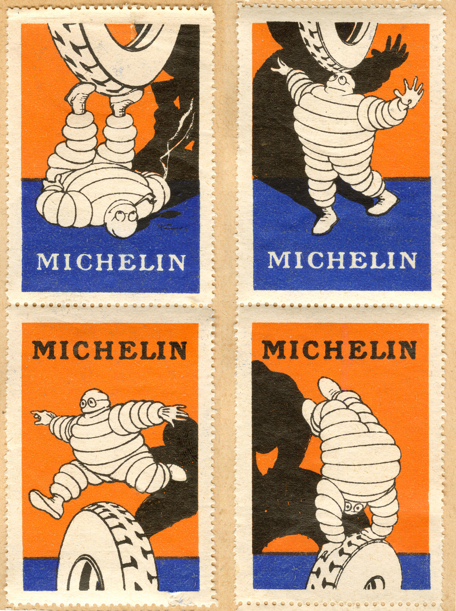
Did you know that the Michelin Man had its own advertising stamps ?! Back in the 1920s, he did not hesitate to put himself on stage to illustrate product performance.A whole series of significant postures and gestures to highlight the main advantages of Michelin tires.
Attributes:
- Caption: Michelin postage stamps featuring Michelin tires
- Keywords: Michelin, tires, stamps, postage, vehicles, advertising, history, transportation, automobiles, automotive, rubber, industry, company, logo, brand, French, innovation, invention
Image 10
Did you know that the Michelin Man had its own advertising stamps ?! Back in the 1920s, he did not hesitate to put himself on stage to illustrate product performance.A whole series of significant postures and gestures to highlight the main advantages of Michelin tires.
Attributes:
- Caption: Michelin stamps of a Michelin man in different positions
- Keywords: Michelin, stamps, Michelin man, tire, four, postage, cartoons
… and 2536 more images
Additional Properties
| Property | Value |
|---|---|
| Wikidata Link | Open Wikidata |
| Property | Value |
|---|---|
| Product Or Material Produced | Tire |
| Product | Tire |
| Headquarters Location | Clermont Ferrand |
| Subsidiary | Nihon Michelin Tire; Tyremore; Michelin Canada; Tyreplus |
| Foundation Date | 1889 |
| Topic’S Main Category | Category:Michelin |
| Freebase Id | /m/0kpxt |
| Headquarters Location | Clermont-Ferrand |
| Legal Form | société en commandite par actions |
| Inception | 1889-05-28 |
| Founded By | Édouard Michelin, André Michelin |
| Isin | FR0000121261 |
| Minitel Code | 3615 MICHELIN (from 1989) |
| Open Library Id | OL2727318A |
| Stock Exchange | Euronext Paris (from 1989) |
| Part Of | CAC 40 |
| Youtube Channel Id | UChx5xfuh31g6Hz3g6NfBuAw (as of 2020-12-10, from 2006-02-01) |
| X (Twitter) Username | Michelin (as of 2018-05-10, from 2015-09-04) |
| Owner Of | MC Projects |
| Industry | automotive industry, manufacture of rubber tyres and tubes; retreading and rebuilding of rubber tyres, plastics and rubber industry, business and other management consulting |
| Quora Topic Id | Michelin |
| French National Assembly Lobbyist Id | 2235 |
| Child Organization Or Unit | Michelin (Canada), Nihon Michelin Tire, , Tyreplus, Tyremore |
| Encyclopædia Britannica Online Id | topic/Michelin |
| Permid | 4295867411 |
| Viaf Cluster Id | 267338489 |
| National Library Of Spain Spmabn Id (Bne V1.0) | XX150102 |
| Gnd Id | 1028895-8 |
| Nlp Id | a0000002685379 |
| Portuguese National Library Author Id | 248580 |
| Nukat Id | n02010800 |
| Isni | 0000000121756243 |
| Idref Id | 02644318X |
| Bibliothèque Nationale De France Id | 11868980t |
| National Library Of Israel Id (Old) | 000106397 |
| National Library Of Latvia Id | 000084173 |
| Bibsys Id | 97052396 |
| Nacsis Cat Author Id | DA08497139 |
| Library Of Congress Authority Id | n80032798 |
| Eu Vat Number | FR33855200507 |
| Official Name | Manufacture française des pneumatiques Michelin, MANUFACTURE FRANCAISE DES PNEUMATIQUES MICHELIN |
| Phone Number | +33-4-73-32-20-00 |
| Fax Number | +33-4-73-32-63-81 |
| Grid Id | grid.436394.f |
| Opencorporates Id | fr/855200507 |
| Legal Entity Identifier | 549300U45EBW2GJV2X93, 549300SOSI58J6VIW052 |
| Pm20 Folder Id | co/016126 |
| Named After | Édouard Michelin, André Michelin |
| Motto Text | Une meilleure façon d’avancer, Motion for life |
| Linkedin Company Or Organization Id | michelin |
| Facebook Username | Michelin |
| Ror Id | 006s85q77 |
| Mascot | Bibendum |
| Manualslib Brand Id | michelin |
| Eu Participant Identification Code | 971320462 |
| Instagram Username | michelin |
| Product Or Material Produced | tire |
| Image | Siège de Michelin à Clermont-Ferrand - Panoramique.jpg, Siège de Michelin à Clermont-Ferrand II.jpg |
| Cobis Author Id | 95a5yja38danyk2f65b5yc1m6wrkcc0, dnq6ux1q74wk2e1d5mpjub9d5mpjub8 |
| Award Received | Silver Anvil Award (as of 2016-01-01) |
| Described By Source | organization’s financials |
| Social Media Followers | 69,045 (as of 2021-01-02), 64,982 (as of 2018-05-10), 70,300 (as of 2021-07-02), 69,934 (as of 2022-02-26), 71,622 (as of 2023-02-10) (+3 more) |
| Uk Parliament Thesaurus Id | 45614 |
| Share Catalogue Author Id | 129380 |
| Coordinate Location | 45.7829475, 3.0944780555555553 |
| Zhihu Topic Id | 19673440 |
| Egapro Gender Equality Index | 93 (as of 2020-01-01), 94 (as of 2019), 93 (as of 2021) |
| Different From | Michelin |
| National Library Of Israel J9U Id | 987007266647605171 |
| Comparably Company Id | michelin |
| Lex Id | Michelin |
| Eu Transparency Register Id | 1413466815-09 |
| Short Name | MFPM |
| Golden Id | Michelin-645WM |
| Crunchbase Organization Id | michelin-2 |
| Cinii Research Id | 1140845216504698368 |
| Encyclopedia Of China (Third Edition) Id | 566691 |
| Weibo User Id | 5520866762 |
| National Library Of Poland Mms Id | 9810554882505606 |
| Youtube Handle | MichelinGlobal |
| Museum Digital Id | 81425 |
| Algerian Trademark Number Id | DZT2016003051 |
| Vikidia Article Id | fr:Michelin |
| Chairperson | Florent Menegaux (from 2019-05-17), Édouard Michelin (from 1889, until 1940), Robert Puiseux (from 1940, until 1959), François Michelin (from 1959, until 1999), Édouard Michelin (from 1999, until 2006) (+2 more) |
| Chief Executive Officer | Yves Chapot (from 2018) |
| Country | France |
| France 24 Topic Id (French) | michelin |
| Field Of Work | tire manufacturer |
| Siren Number | 855200507 |
| L’Humanité Topic Id | michelin |
| Yale Lux Id | group/e04e7fcf-5ce4-44cd-bc08-6b5c56123997 |
| Location Of Formation | Clermont-Ferrand |
| Contact Page Url | https://www.michelin.com/nous-contacter |
| Subsidiary | Michelin (Canada), Nihon Michelin Tire, , Tyreplus, Tyremore |
| Isin | FR0000121261 |
| Coordinates | 45.7829475, 3.0944780555555553 |
| Product | tire |
| Facebook Id | Michelin |
| Twitter Username | Michelin (as of 2018-05-10, from 2015-09-04) |
| Linkedin Id | michelin |
Revenue History
| Revenue ($) | Year information | Bucket |
|---|---|---|
| $15.40B | as of 2000 | 10B-50B |
| $15.77B | as of 2001 | 10B-50B |
| $15.65B | as of 2002 | 10B-50B |
| $15.37B | as of 2003 | 10B-50B |
| $15.69B | as of 2004 | 10B-50B |
| $15.59B | as of 2005 | 10B-50B |
| $16.38B | as of 2006 | 10B-50B |
| $16.87B | as of 2007 | 10B-50B |
| $16.41B | as of 2008 | 10B-50B |
| $14.81B | as of 2009 | 10B-50B |
| $17.89B | as of 2010 | 10B-50B |
| $20.72B | as of 2011 | 10B-50B |
| $21.47B | as of 2012 | 10B-50B |
| $20.25B | as of 2013 | 10B-50B |
| $19.55B | as of 2014 | 10B-50B |
| $21.20B | as of 2015 | 10B-50B |
| $20.91B | as of 2016 | 10B-50B |
| $21.96B | as of 2017 | 10B-50B |
| $22.03B | as of 2018 | 10B-50B |
| $24.14B | as of 2019 | 10B-50B |
| $20.47B | as of 2020 | 10B-50B |
| $23.80B | as of 2021 | 10B-50B |
| $28.59B | as of 2022 | 10B-50B |
| $28.34B | as of 2023 | 10B-50B |
| $27.20B | as of 2024 | 10B-50B |
Operating Income History
| Operating Income ($) | Year information | Bucket |
|---|---|---|
| $3.02B | as of 2022 | 1B-10B |
| $2.65B | as of 2023 | 1B-10B |
Net Profit History
| Net Profit ($) | Year information | Bucket |
|---|---|---|
| $399.05M | as of 2000 | 100M-500M |
| $295.97M | as of 2001 | 100M-500M |
| $580.80M | as of 2002 | 500M-1B |
| $317.53M | as of 2003 | 100M-500M |
| $515.14M | as of 2004 | 500M-1B |
| $889.00M | as of 2005 | 500M-1B |
| $573.00M | as of 2006 | 500M-1B |
| $772.00M | as of 2007 | 500M-1B |
| $357.00M | as of 2008 | 100M-500M |
| $104.00M | as of 2009 | 100M-500M |
| $1.05B | as of 2010 | 1B-10B |
| $1.46B | as of 2011 | 1B-10B |
| $1.57B | as of 2012 | 1B-10B |
| $1.13B | as of 2013 | 1B-10B |
| $1.03B | as of 2014 | 1B-10B |
| $1.16B | as of 2015 | 1B-10B |
| $1.67B | as of 2016 | 1B-10B |
| $1.69B | as of 2017 | 1B-10B |
| $1.66B | as of 2018 | 1B-10B |
| $1.73B | as of 2019 | 1B-10B |
| $625.00M | as of 2020 | 500M-1B |
| $1.84B | as of 2021 | 1B-10B |
| $2.01B | as of 2022 | 1B-10B |
| $1.98B | as of 2023 | 1B-10B |
| $1.89B | as of 2024 | 1B-10B |
Employees History
| Employees | Year information | Bucket |
|---|---|---|
| 105,700 | as of 2016 | 100K-500K |
| 105,800 | as of 2015 | 100K-500K |